Harley DavidsonA heritage brand at a crossroads. A multi-channel activist campaign for change.
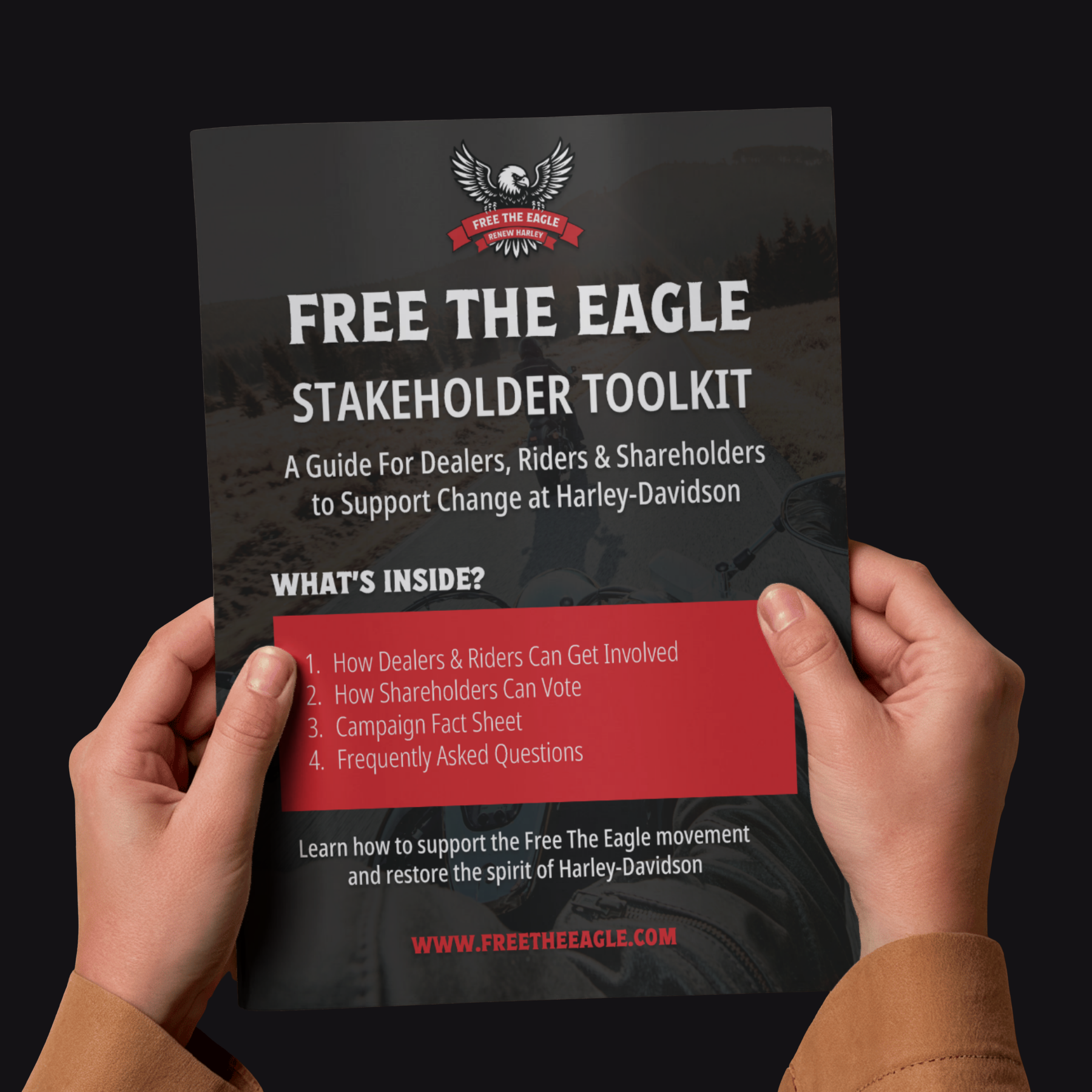
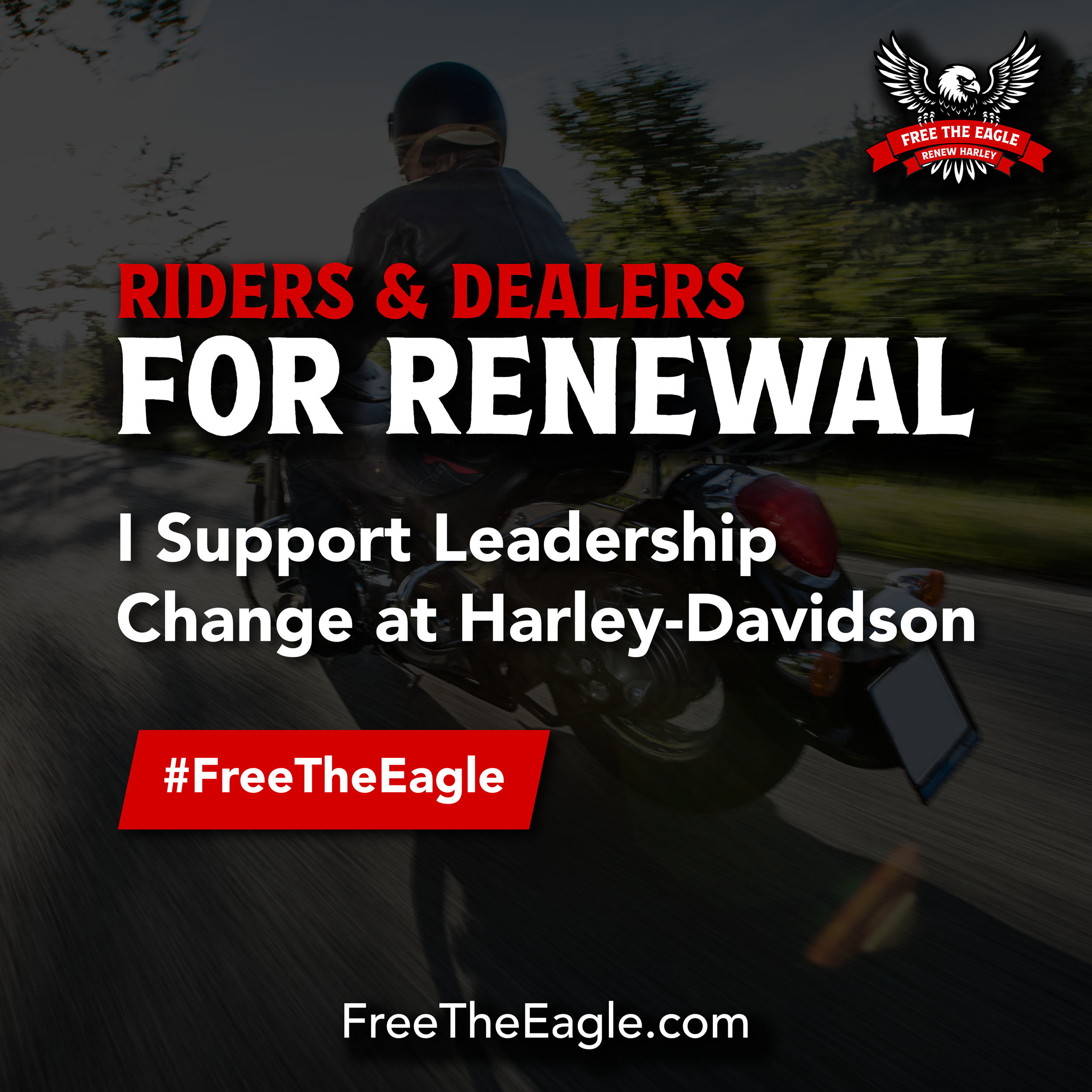
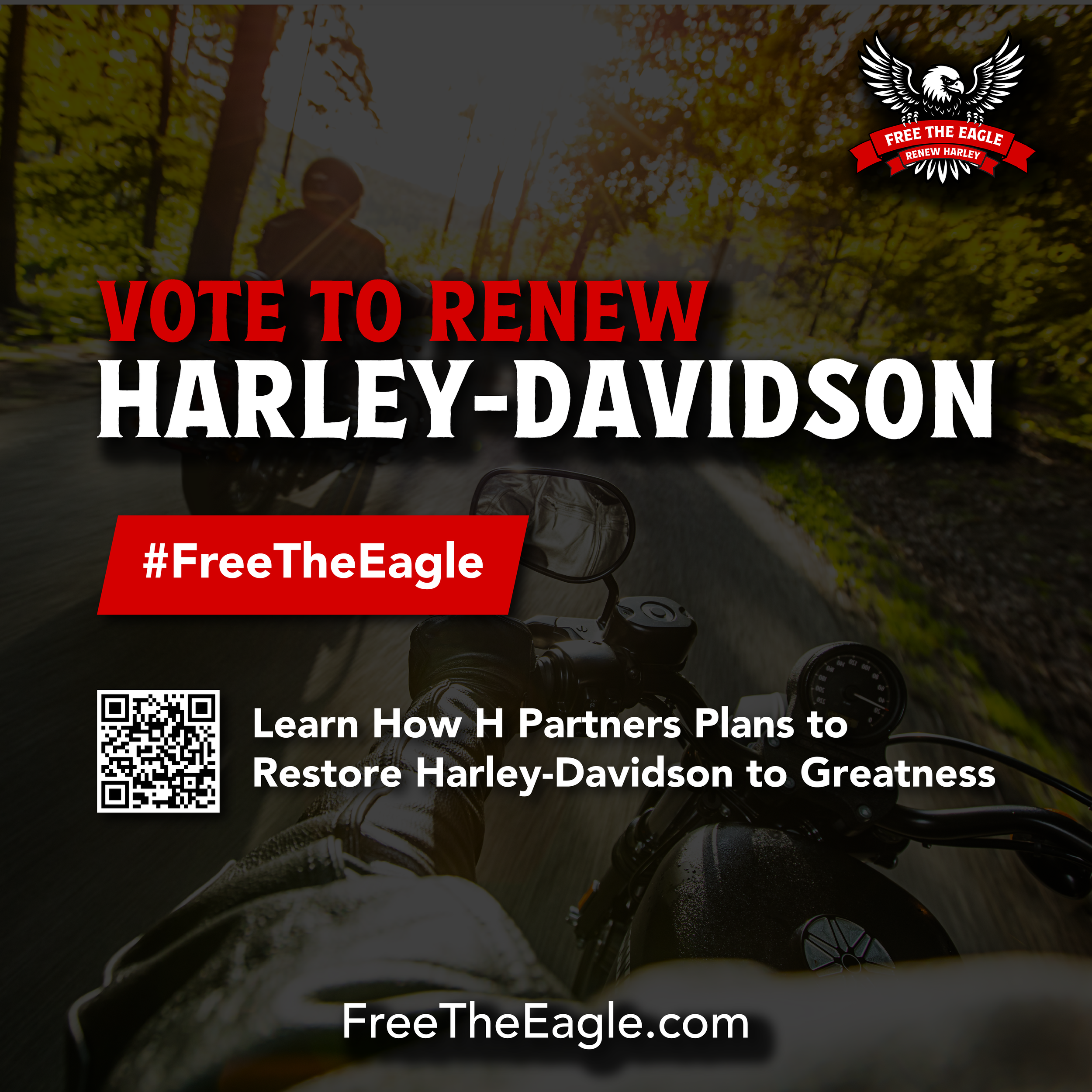
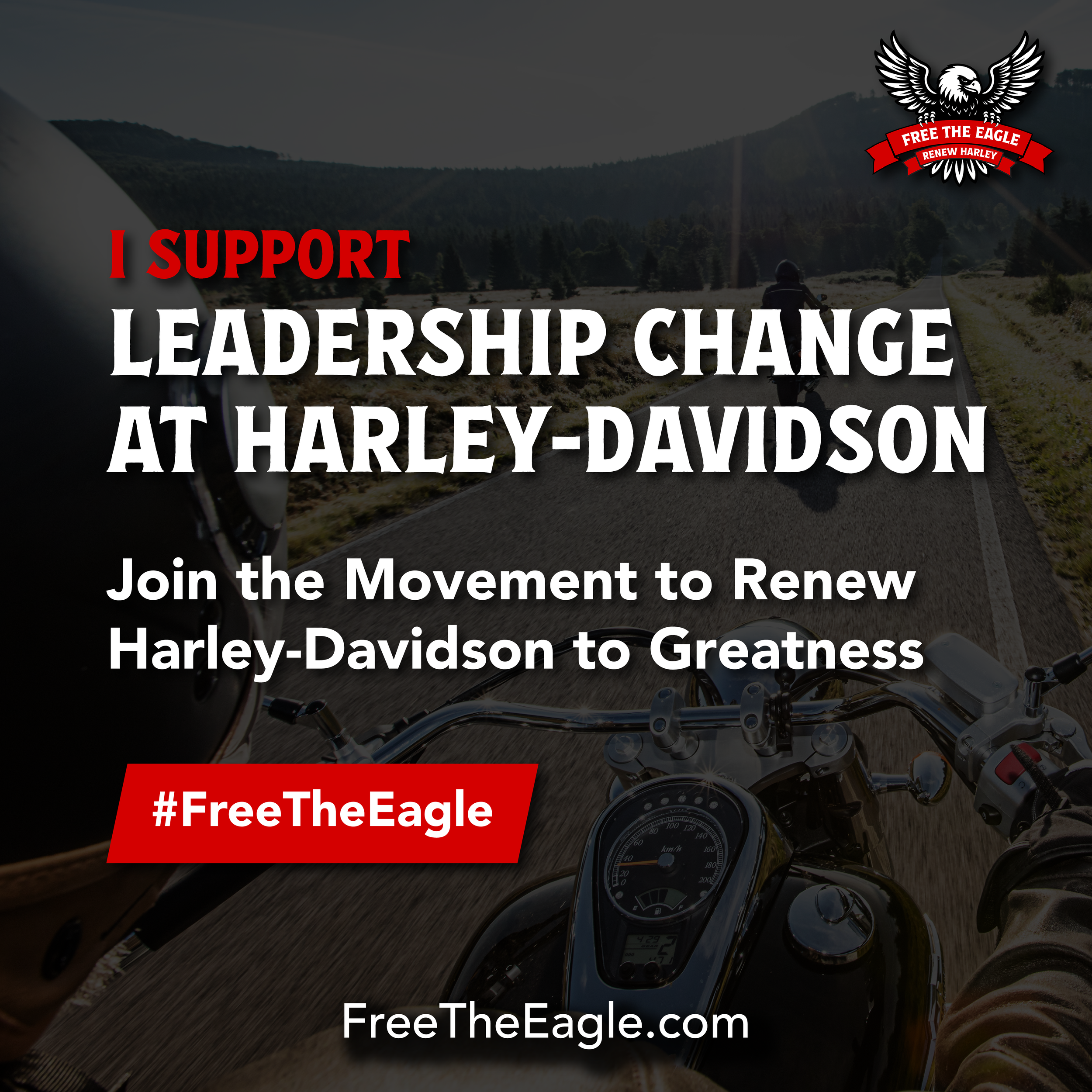
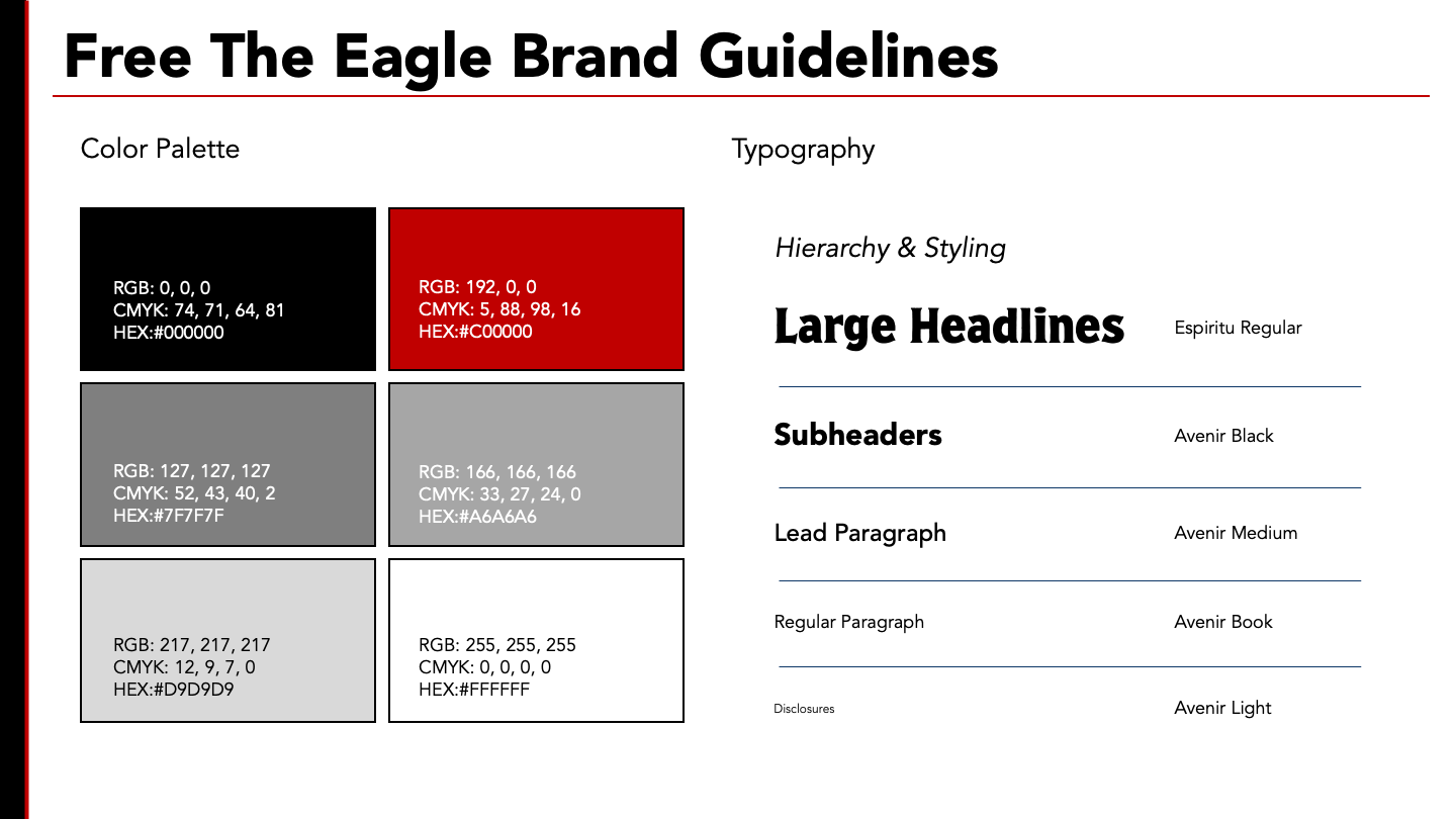
Bespoke micro branding for the campaign. The goal was to maintain the edgy Americana feel of the Harley Davidson brand but give the campaign its own distinction — a bold, high-contrast palette rooted in black and deep red, paired with a rugged, condensed headline typeface to signal strength and urgency, while cleaner supporting type keeps the messaging sharp and credible.
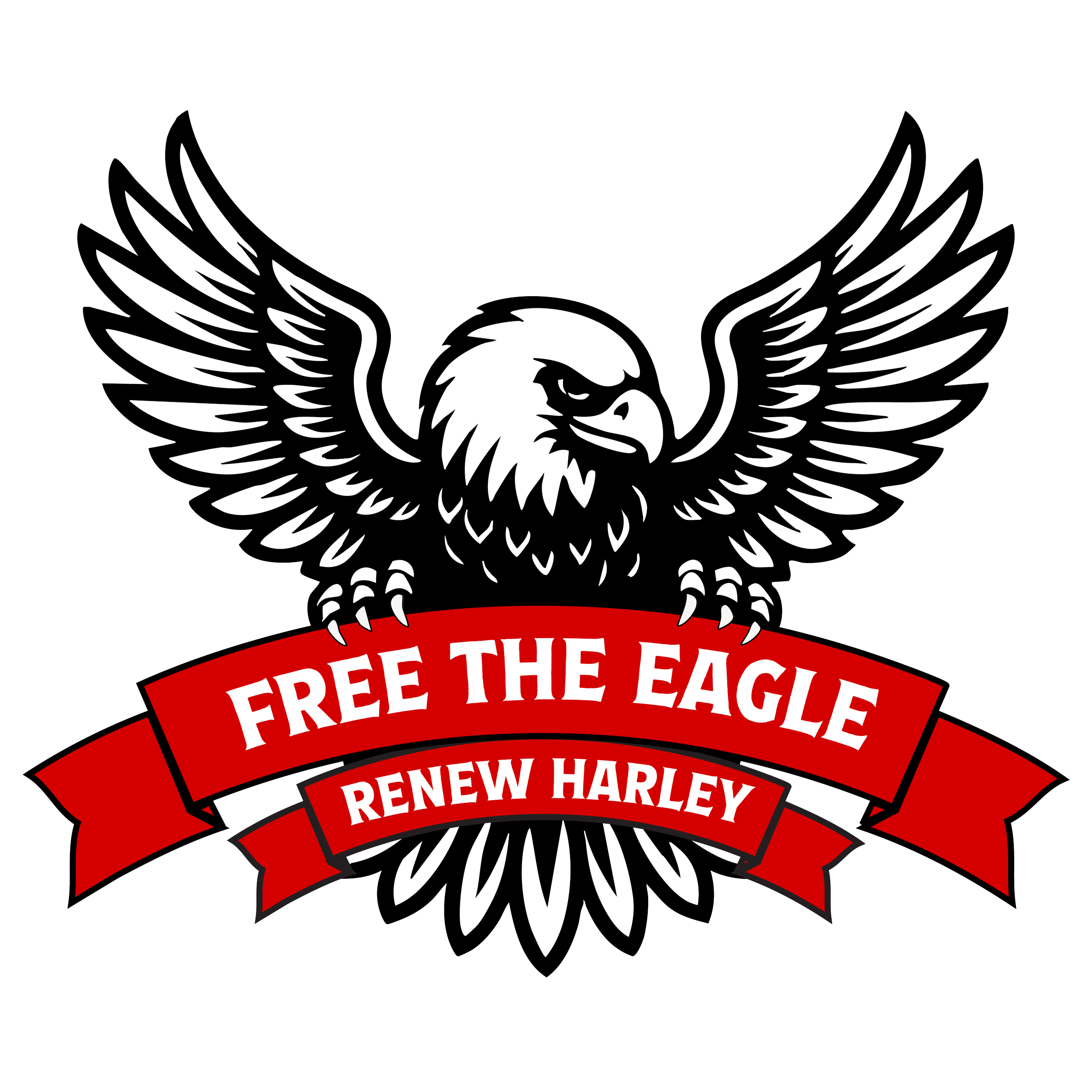
Custom campaign logo built on Harley Davidson's own eagle iconography. The design reclaims a symbol core to the brand's identity, reframing it as a call to action — signaling that this is a fight over what the brand stands for, not an attack from outside it.